This project here is very near and dear to me. First of all, my client has supported my work for a long while and when it was time for her to open her very first dental office, without hesitation, she came to me. This has been one of my greatest project that I have taken on since it utilizes all of my design assets, and I got to control the quality of the work across all design mediums – print to web to the interior decor.
I want to thank her, and I hope she is happy with the end product as much as I am. There will be a few more posts on this client. I just wanted to share these initial projects. We are currently finishing up the interior decor, and her office doors will be officially opening June 8th in the Bloomingdale, Illinois area. Also, I will be sharing her "new client promotions" too if any of you are looking for a new dentist. Trust me, you'll want to go visit this dental office.
This particular project began back in January of this year, and it started with the name. I worked with her in refining her business name. She didn't want the typical dental name incorporating the word "smiles" like everyone else. Something clean, simple, and reflects the nature of the business. We went back and forth several times and one word kept on sticking, and it wasn't taken. It was the word "pure", and it sounded really nice with the word "dental". "Pure" represents cleanliness, and that's why we go to the dentist – to keep our teeth/mouth as clean as possible. Then the word "spa" was thrown into the name, because this new office was going to embody spa-like services. There is this new trend called "dental spa" where dental offices want their offices to now be soothing and comforting for their client visits. And we all know, dental offices aren't at the top of anyone's list for places to go visit.
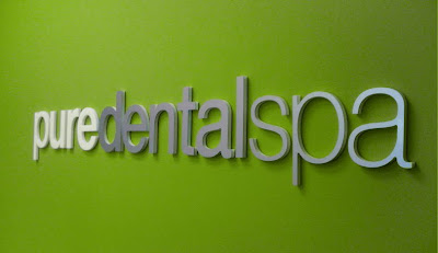
With the name down, Pure Dental Spa, it was time to develop the identity. As soon as the name was selected, I had a good idea on how it was going to look, and the client was totally one the same page with me; it was great. The fact that I knew I was going to be working on the interior decor of her office, it helped me build her brand colors since she really wanted an avocado-like green color on her office wall. I envisioned in my mind seeing the word "pure" all in white against the green wall, and it truly brought out the essence of clean in the word and the nature of the business.
Interior Office Signage
Pure Dental Spa color palette:
white, grey & green. White is pure and clean. Grey represents a brushed aluminum material and the sterilized equipment that is used to clean our teeth. And green is fresh, calming, and it is all "spa".
For the logo identity, I used a very clean, modern typeface, Helvetica Neue, and balanced the weights and the kerning between the letters. "Pure" is the boldest and "dental" is the second heaviest weight. Those two words have the most emphasis in weights, because they are the most important. "Spa" is secondary, but still important to the overall vision.
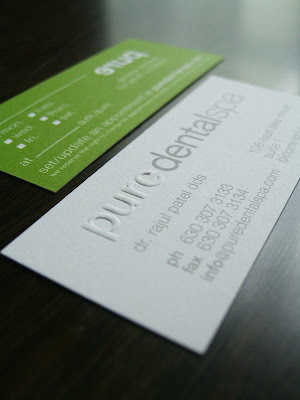
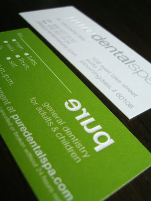
For the business/appointment cards, I knew we had to print them with a very cool technique called blind embossing – where an image is raised up from the flat surface of the paper. This was how I was able to keep the word "pure" white on white paper. And on the reverse-side, the paper was flooded with green, and where the word "pure" was embossed, it was kept white also. These are some well-designed appointment cards I must say.
Business & Appointment Card

Originally, I wasn't planning on designing her website since I am not a huge fan of website design. I always felt it was one of my weaknesses. I thought I was going to be handing over logo files, color codes and some images. But after we saw the first round from the programmers, I knew I had to get my feet wet and guide the overall structure, because it wasn't meshing with her brand essence, and I couldn't let that happen. After it was all said and done, I was surprisingly happy with the end product and so was the client. This is only a teaser still image of the website that I have designed. It's not live and running yet. The programmer is currently working on it to get it to match my design template.
Website Homepage
 {Identity System, Signage & Website designed by Chon}
Stay tuned everyone... there is still more to come on this client, and I am looking forward to seeing the final product. A lot of time has been dedicated to these projects, and it's nice to see them getting done and finished to perfection!


 For some reason, I like out of focus shots like the one below. There is a timeless quality and feeling of movement that is different and nice compared to the always in focus, sharp detailed shots.
 {Images are from JillThomasPhotography.com}
 When I say I want to the give the bride "a little more edge" to her wedding day, I mean to modernize it from where she wants which may come off a bit dated based on her original key words. And I plan on doing it with a custom, green pattern with a tailored European feel, and I would like to contrast it with another graphic pattern – black & white stripes. However, these patterns won't exist everywhere in the decor; it will be used thoughtfully & selectively throughout her wedding and reception. It's those extra little accents that will give it that personal, tailored, classic appeal with a twist to the European Era.
 Invitation design: custom black cameo portraits, incorporate traditional scroll flourish designs, custom green pattern on thick, uncoated paper, letterpress, and a black envelope with a personalized wax seal
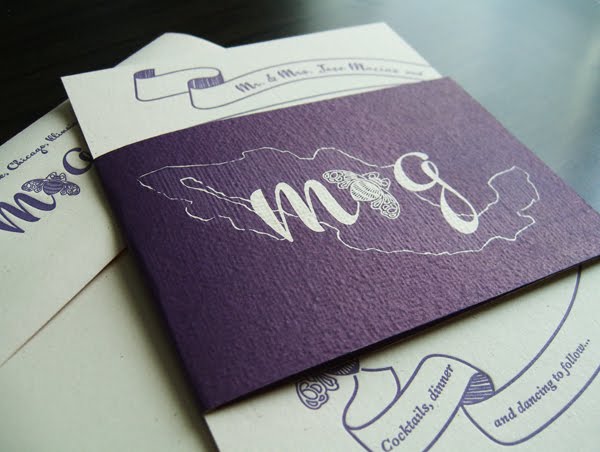


 {Wedding Invitation & Print Accessories designed by Chon}

 If you want to take the unconventional route for bridesmaids dresses, mix up the styles, the length, fabric and the texture of the dresses. However, give your girls a specific color palette to follow, put them to work, and let them go hunt for the perfect dress that reflect their taste and body shape. Tell them to buy a few dresses, and then get together for a dinner party at someone's house, and do a "Dress-Up" party. I think that would be so much fun. And you can see how all the dresses visually work together, and all parties should happier with the end result.


 {Business Card & Logo designed by Chon}
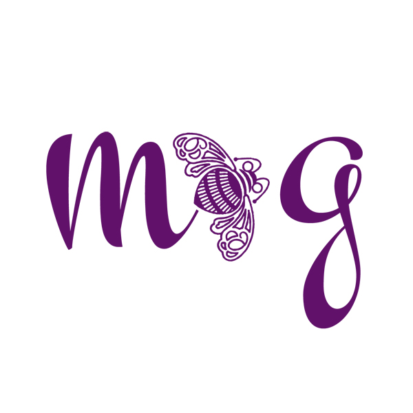 These next few designs are of the roman numeral X for an 2010 October wedding. This particular client wanted a very strong X mark, but wanted it to be different, graphic, have personality along with it being elegant since it is for a wedding. I presented her with over 5-6 designs, and the 4 seen here were my top picks. I pushed the envelope on the design, more than what she wanted, because I wanted to show her how much you can manipulate the letter X and have fun with it. And the winner is — the last one pictured; simple, elegant and still has movement.


 {Custom Monograms designed by Chon}
 Pure Dental Spa color palette: white, grey & green. White is pure and clean. Grey represents a brushed aluminum material and the sterilized equipment that is used to clean our teeth. And green is fresh, calming, and it is all "spa".

 Originally, I wasn't planning on designing her website since I am not a huge fan of website design. I always felt it was one of my weaknesses. I thought I was going to be handing over logo files, color codes and some images. But after we saw the first round from the programmers, I knew I had to get my feet wet and guide the overall structure, because it wasn't meshing with her brand essence, and I couldn't let that happen. After it was all said and done, I was surprisingly happy with the end product and so was the client. This is only a teaser still image of the website that I have designed. It's not live and running yet. The programmer is currently working on it to get it to match my design template.
 {Identity System, Signage & Website designed by Chon}


 {Invitation designed by Chon}