[ Visit the New Website to see current design work and to reach Chon for services. ]

Design With Chon (DWC) – a boutique design studio with defined niches in (1) visual communication, (2) event design and (3) interiors. Each of these industries are huge in themselves, but DWC’s goal is to achieve good design in all its various forms, whether it’s from the branding of your business to saying “I do” to transforming interiors. Let me, “Chon," be your personal design consultant + stylist for your business, wedding or home. A balanced environment makes you feel good, and I am here to inspire your surroundings.

Monday, September 19, 2011

DWC Work: Good Infographics

It's Monday + back to work! Here's another long over due post for "Monday Means Business". This is going to be a short little informative post since I have tons of work to do today and one project that I am working on as we speak is a pretty complex infographic timeline for my client, Redbox. I'll share the timeline once it's complete and live. However, there is one illustrative chart design for Redbox that is currently running on their website called Share Your Love that anyone can participate in. Participants have a chance of winning a Sony Home Theater Package! Visit Redbox.com to learn more.

In this promotion, I created a simple 1-2-3 step by step process in what a participant has to do to enter the contest. It was a fun, simple project, and I like the fact I could explore my illustrative skills in Adobe Illustrator. I love the personality that I was able to give the female character without defining a lot of the details on the face and body.

Share Your Love – Infographic

[Infographic Illustration ©2011 Design With Chon]

And now back to today's topic — Good Infographics. In case you're not sure what an infographic is, here it is as defined by Wikipedia. "Information graphics or infographics are graphic visual representations of information, data or knowledge."

Today, I want to expand on the great possibilities with infographics especially for businesses or nonprofits that need help explaining a complex service or point of view. Visual icons like the samples shown below say a lot with very few words, and the average viewer is visually able to understand your point. Like they say, "A picture is worth a thousand words". And when you use these infographics in your printed brochure or digitally in combination with animation on your website, it will keep your audience's attention longer, and they will be more intrigued to learn more about your company's purpose.

All of the infographic charts shown below are from the GOOD website, and they are only a highlight. Do explore the site and see the endless possibilities in telling a story through visual icons. The work shown on their site are really well thought out, and they are sure to be some of the best infographics out there. I visit their site periodically to gain inspiration on how to push the envelope in graphic structure + layout.


One last point, infographics can be simple or complex as the one's featured, but they need to make some sort of logical sense if you are going to request a designer to customize one for your business. Infographics aren't a quick to turnaround project; they do take time, and visually everything needs to work together. Like any design project, it's a balancing act of visuals and type, and it needs to be clearly structured to the viewer to absorb the information at hand.

If used smartly for a corporate company like a law or tax firm's website that lack good photos or visual content, an animated infographic would be a good way to spice it up and explain some insightful point of view/knowledge to your potential new clients. Your website will surely not be forgetful compared to your competitors humdrum sites.

[Images via www.good.is]

Friday, September 9, 2011

DWC Work: Stephanie + Justin Wedding Invite

Newest client wedding invitation was printed + delivered to the client! To see the original "Enchanted November" moodboard + read the back story for this wedding invitation set, click here.

It's hard to tell the pearlescent nature of the paper in the photos, but you can see the subtle sheen and the shimmer in some of the close-ups. The contrast of the deep red + brown gradients with the shimmery champagne hue is just lovely.

One-Folded, 5 x7 Card – Front + Back

For those who are interested in the production process, here are the technical specs for this job. The one-folded, 5 x7 invitation and the self mailer response card were printed 4-Color, Digital on Citi Paper USA, Autumn Hay, 98C weight paper. The adhesive label was also 4-Color, Digital, but printed on standard adhesive paper that wasn't iridescent for cost efficiency. No printing on the chocolate A7 envelope as per the original design; client opted for addressed labels where she could get custom calligraphy done in chocolate ink. Also, I provided the client with the "H" monogram art file so she could get custom matching stamps.

"Enchanted November" Wedding Invitation Set

One-Folded, 5 x7 Card Interior + Response Card

Self-Mailer Response Card – Front + Back

Adhesive Label on A7 Envelope – Front + Back
[Monogram + Wedding Invitation Set ©2011 Design With Chon]

Next design phase for Stephanie + Justin is to develop the rest of their event day day collateral (wedding program, escort cards and menu) so it coordinates with the established theme and colors. We will be printing on the same iridescent paper stock, too. Stay tuned!

Thursday, September 8, 2011

DWC Work: Halloween 1st Birthday Invitation

It's Thursday, and usually the focus is on Interiors, but my basement renovations is on hold until the wallpaper arrives. So in the meantime, I thought I would share some invitation projects that have been completed and printed. This is a short + sweet post for a 1st birthday invitation that I recently designed for a client friend. I essentially had free reign to do what ever I wanted as long as it embraced Halloween and still catered to little kids. This is isn't the normal parameter for most design projects that I receive from clients, and when I do get an opportunity like this, I really look forward to designing it.

This 1st birthday invitation is for a boy so it required masculine colors which worked well with the Halloween theme. Being a themed invite, I didn't want to go overboard with it being gruesome/scary and wanted a "cuteness" factor, because this is a party geared towards little kiddies ranging in ages from 1 to 5 yrs old. And the perfect visual solution that also happens to be on trend with the season are owls. In interior retail stores like West Elm, I see owl designs all over. However for this invite design, I made the owl a baby with big, white googly eyes on an overly rounded body.


In the background, I created a custom pattern with different sized googly eyes repeated, and layered it on a textural, brushed background to add another visual layer of interest. Isn't this baby owl so adorable!? I just want to pinch his cheeks. :)

[Illustration + Invitation ©2011Design With Chon]

The Halloween owl theme doesn't just stop at the invite. I love connecting the invite theme to the actual party event, too. In addition to the invitation, I provided the client with some creative insight on how to bring the owl theme to life. I found some great dessert ideas that I thought the kids would love. Check out the adorable + delish owl cupcake below. Also, I thought it would be fun to include candy bowls of eyeballs lying around. Obviously, these would be chocolate covered candies covered in a decorative eyeball foil. There are tons ideas out there, you just have to do a little research on how to be creative.


Any questions on custom invitation work or need help with ideas for your party, just inquire at designwithchon[at]gmail.com. Thanks for visiting + Happy Halloween even though its a bit early!

Monday, August 29, 2011

DWC Work: Redbox

Monday is back + so is "Monday Means Business" blog focus. I haven't shared any posts on this topic in awhile, because I have been bogged down working on several design projects for one particular business client — Redbox. They are significantly known for their $1 movie rentals, and as of this year, you can rent $2 video games, too.  For today's post, besides highlighting some of the work that I have created for Redbox, I want to go more in depth and define what Visual Communications is. I bring this up, because I continually get asked, "So what do you do again?" and then I specifically have to go into a list of all my capabilities, and it's still not fully understood. Visual Communications seems like a broad term, but the idea is pretty simple. However, it comes in so many forms that the average person doesn't recognize it. It encompasses a range of fields from advertising, graphic design, product design, illustration, photography, environmental design, signage and even film.

As defined according to Wikipedia, "Visual Communication as the name suggests is communication through visual aid and is described as the conveyance of ideas and information in forms that can be read or looked upon ... primarily presented or expressed with two dimensional images, it includes: signs, typography, drawing, graphic design, illustration, colour and electronic resources. It also explores the idea that a visual message accompanying text has a greater power to inform, educate, or persuade a person or audience."

And my even more simplified definition is — if it involves type and/or imagery and a message is being visually conveyed whether good or bad, it's a form of Visual Communication; and it exists everywhere in the environment + digitally! From the App icons on your iPhone, the news article in the paper or on the iPad, the instruction manual, labels on products that you use, the graphic on your T-shirt, junk mail, signage/banners in retail stores, and the list just keeps going. And more than likely, a designer like myself had a hand in the development of its design.

The work that I have produced thus far for Redbox has utilized most of my skills as a designer ranging from print to digital communications. I have been working with their marketing department to develop attention getting graphics to support their seasonal promotions and branding efforts. This first few images you see are part of their "10 Days of Deal" promotion. I created a custom die-cut Sticker Decal that was applied to the actual Redbox kiosk in retail stores and continued the messaging to support various digital applications for email and on their website.

10 Days of Deals – Sticker Decal on Kiosk

10 Days of Deals – Online Banners on Redbox.com

I have produced a variety of promotional stickers to go onto the Redbox kiosk, but one of my favorite and most memorable one for me was the Rango New Release sticker.  I saw it in person this past July as I was walking past it in a Jewel Osco grocery store.

Rango New Release – Sticker Decal on Kiosk

The Social Media Sticker stayed in concept phase due to production/budget restrictions, but I thought it was a great way for Redbox to connect further with their users directly, because it would've been applied on every single DVD that was rented from the kiosk. For this, I customized the social media icons to reflect the Redbox brand.

Social Media Sticker on DVD disc

This isn't your award-winning ad, but it showcases my retouching and Adobe Photoshop skills. Like most projects in this world, we have budget constraints and can't afford a photo shoot or high-end stock photographer. As a designer, we have to problem solve, work with what we have and make it look good. For this ad, all I had were three separate images (Redbox kiosk, a football and a section of grass), and I had to compose it into an 8.5" x 11" ad size where they would work seamlessly well together. The grass area was the most time consuming, because I had to color correct, blur, repeat and extend it into one larger plot of grass so it would look somewhat natural and to scale. On top of that, I retouched the football and Redbox kiosk into the grass so they appeared to be sitting in the grassy environment. A slightly tedious assignment, but I like a good challenge in testing my Photoshop skills.

Print Ad Sponsorhip

Print Ad – Close-up of Retouching

No only can I do small print projects, but I can design graphics for large-scale spaces such as Redbox's environmental booth for their debut at the Electronic Entertainment Expo (E3) in Los Angeles this past June. It's an annual trade show for the computer and video games industry, and Redbox officially announced they now offer video game rentals at 27,000+ retail kiosks.

Environmental Graphics

I have created countless digital banners for Redbox for their eblasts, website and banner ads, and they aren't the most creative, but they communicate the message clearly in these small, fixed banner ad sizes that we are confined to on the web.

Digital Graphics for Email, Redbox.com + Banner Ads
[Graphics ©2011 Design With Chon]

If anyone out there is still unsure what I do, please do ask. I don't mind explaining my services, because at times it can get complex. And if I don't have an example in my design portfolio for what you seek, just ask yourself this question —"Does it involve type and/or imagery?" And if your answer is "Yes", then more than likely I can design it for you and your business.

Thursday, August 18, 2011

A Fresh Look on Moulding + Trim

As I am nearing the end in selecting finishing details for my basement, I wanted to try some new design techniques such as painting moulding + trim in a different color. This is nothing new, and it's been around for some time now, but how do we keep it fresh + interesting for today's modern homes. Most new homes that are built by the abundance have white painted trim + moulding, because it brightens up the interior space, and everyone seems to like and accept that bright white shade.

Don't get me wrong, I love the white graphic statement along the edges in my home. Currently, my whole house has the white trim + moulding, however for our basement, I wanted to switch it up. I chose to have it painted a light grey so it blends with the textural, grey wallpaper that I have chosen for the main living + office space. I wanted to keep the eye moving from floor to ceiling without any "white" outlines on the wall. You can see the newly painted trim in the image directly below. The shot features my Art Studio pocket poor with frosted glass, closet door, trim, and they are all painted in the same light grey shade. Wallpaper is not yet in place. It's going up in the next few days. :)

My Basement

Here are a few other great examples of painted moulding where the trim, wall and doors all blend together. They both convey a very clean, minimal look without visual interruption from one plane to the other.


Now if you're looking to make a visual statement through paint, pick a color of paint that contrasts your wall color.  Your trim + moulding color can be subtle or as intense as the vibrant wallpaper pattern seen below in blue. I do love the graphic black painted trim with the pure white walls.


Painting is very easy on the renovating budget especially if you want to switch up the look of your interior space without investing in whole new furniture and cabinets. If you don't want to paint trim, how about your doors. See black door example; it's a great, bold touch. A simple coat of paint does the job and can certainly freshen up any space.


Thursday, August 11, 2011

Hot Finds from Urban Outfitters

I am always hunting + seeking unique finds to add a fun, designer flair to my home. And one good source that I love browsing on is Urban Outfitters Apartment section, and I love how their price point is quite friendly. I am looking to incorporate the Chevron print some how into my basement/art studio, and Urban Outfitters has a great selection of home decor with the zigzag pattern.


Chevron Dress Form
Chevron Area Rug
Chevron Duvet Cover
Chevron Side Chair

Here are a few other eye candy finds that I am thinking about for our basement. I am gravitating towards the vintage Leather Butterfly chair + the Globe Pouf, too, for our Living Room area. And the etched letters (DWC) for my Art Studio for some industrial, ecclectic wall decor.


Leather Butterfly Chair
Globetrotter Pouf
Folding Library Bookshelf
Industrial Stencil Letter

If you're looking to add some more depth + visual interest to your interior space, do browse on Urban Outfitters Apartment section to mix it up. It's definitely not just an apparel store. Happy hunting and feel free to share your great finds.

Wednesday, August 10, 2011

DWC Project: Stephanie + Justin Wedding Invite

It's Wedding Wednesday! It's been a long time since I have blogged, and I do miss it, only if I had a few more extra hours in the day. Anyway, I have something lovely to share today as I blog from my family vacation in Leland, Michigan. :)

So this is one of the many things that I have been up to in the world of Design With Chon. My newest wedding client, Stephanie + Justin, came to me to help them visually define their special day which is only a few months away – 11.11.11. Stephanie already had her colors defined, selected her key vendors such as church, wedding dress, venue, cake bakery and florist, but she was unsure what statement or visual theme that she wanted her guests to take away from her wedding day. In addition, she wanted the invitation + event collateral (escort cards, program, table #s) to be visually branded into one umbrella idea. And that's where my design eye came into play.

After I had my first meeting with Stephanie, I essentially knew what she was going for, and instantly, the ideas were brewing in my head. I always get excited for new creative projects like these. Immediately, I jotted some notes into my notebook. I love to think about the bigger picture and think + design all the way down to the little details such as the escort card on the table.

Before I even began designing the invitation set, I started with a moodboard as usual to make sure the client is on board with the design direction. This wedding is in November, she had fall-like colors, but she didn't want an Autumn, leaf theme. She wanted to embrace certain rustic elements, but rather communicate elegance, sophistication and have it be warm + inviting for her guests. And my design solution to her visual concerns was "An Enchanted November" wedding theme.

An Enchanted November

Main Colors: Mocha + Golds
Accent Colors for Contrast/Pop: Cranberry Red + Orange Marigolds
Texture + Interest: Rustic sophistication, embracing nature elements, but richen them with warm, bold hues in florals + textural linens, allow for drama by creating height and dimension with flowing, suspended forms like red Amaranthus floral and structural branches like Manzanita or Curly Willow for the centerpieces. And to top all these visual layers off, add some glitz with jeweled, crystal chains for embellishment.
Invitation: Incorporate nature elements, wedding color palette, wedding date - 11.11.11, the Letter "H" and the glitz will come through with the pearlescent paper stock.


For the invitation + wedding day event collateral, the key defining element that will be branded across all wedding components is the "H" monogram which stands for the groom's last name. To make it as unique as possible for Stephanie + Justin, I deconstructed the letter "H" by replacing the connecting bar with a graphic branch. I created depth and interest by playing with rich, deep gradients composed of the mocha + cranberry hues. The 11.11.11 date is written in a classy, but in a not-so-stuffy script typeface below the monogram in the invitation set.

[Monogram + Invitations Set ©2011 Design With Chon]

The main invite is a one-folded card with a loose, self mailer RSVP card. For the typography, I wanted it to be soft + bold, and have it flow + move by using different opacity levels. Also, I broke it up by having the information across two pages.

The full invitation set is going to be printed in 4-color process on a warm, champagne, pearlescent paper stock. The tonal ranges of the deep red + chocolate gradient will be contrasted and perfectly balanced by open areas of the iridescent, glitz-like paper. Not reflected in the image above, but see where the white areas are, imagine it in the pearlescent paper in its place. And it's all going to be housed in an opaque, chocolate, square flap envelope. For the envelope, we are either going with white foil stamping for the return address, or a custom, rectangular label that will wrap around the left edge of the envelope (not seen above).

Stay tuned for the final printed product in roughly two weeks! It's going to look even more spectacular.

Friday, July 8, 2011

CSW Magazine "Designer's Challenge": Behind The Scenes

Thank goodness for Fridays, and it's a beautiful day to be out! Normally on Friday, I share my topic for bridging the design gap between business, events + interiors, but today I am going to show you a behind the scenes look into the Chicago Style Wedding Magazine "Designer's Challenge" photo shoot that happened back in March of this year. I had to keep all the images + videos hush hush until CSW Magazine launched and published it, and that's what happened this past Wednesday.

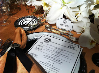
Technically, you could say this post covers business, events + interiors, because aspects of my logo + branding background was integrated into the thought process of the invitation and the matching event collateral pieces. As you can see, the iconic monogram was splashed all over the "Art Deco Meets Old Hollywood" themed wedding event that was concepted by the fabulous Master Bridal Consultant, Frank Andonoplas of Frank Event Design that I had a pleasure to work with on this "Designer's Challenge". And we can't forget that the tablescape and all it's surrounding elements are harmonious with the interior environment creating a mood that is captivating, rich, warm, and definitely a dinner reception that any guest would be delighted to attend.


First, I want to highlight the creative process that went into developing the invitation set + event collateral for the "Art Deco Meets Old Hollywood" theme. Before the design came into fruition, I had several conversations with Frank, the planner/stylist, for the look of the invitation. Key words thrown out were Art Deco, Hollywood Glam, Architectural, Black, White + Gold, and of course, it had to be bold, graphic and make a visual statement like the genre that we were going after.

I began with developing an iconic, logo-like monogram that I knew I could repeat graphically + brand across all the extension wedding pieces (menu, place cards, drink coaster, cake). For the invite, I placed the monogram at the top so it would be the visual focal point, and then everything else around it would branch out and balance the visual playing field. I used 2 different fonts, but similar in character so they didn't clash. With the linear lines, I wanted to create structure, shape + movement so it forced your eye to move around the space, similar to what architecture does. In addition, I hand cut the corners to match the movement of the lines and added some glitz with hand applied black crystals.

[Invitation/Event Collateral ©2011 Design With Chon, LLC]

This is definitely not the cookie-cutter layout. Each printed piece was custom designed and tailored to have it's own feel, but still visually cohesive. Click here to see the full collection of images for the "Art Deco Meets Old Hollywood" invitation set.

Now it's time to see the actual photo shoot that the whole invite set was designed for, and here's the whole team that made it happen! Visionary credit for the whole thing of course goes out to Frank Andonoplas, Master Bridal Consultant, who is well known in the Chicago area and recognized for his social planning expertise in the world of wedding + events. Please excuse the photo quality; they were taken with my iPhone, and they don't do the end product justice in terms of color + richness.

THE TEAM
Planner/Stylist: Frank J. Andonoplas, MBC | FrankEventDesign.com
Floral: Anna Held Flower Shop | annaheldflorist.com
Cake: Bittersweet | bittersweetpastry.com
Monogram, Invitations + Event Collateral: Design With Chon | designwithchon.com
Linens: BB&J Linen | bbjlinen.com
Rentals: Tablescapes | Tablescapes.com
Lighting: Yanni Design Studio | yannidesignstudio.com
Chairs: Classic Party Rentals | ClassicPartyRentals.com


I must say, Frank did a superb execution embracing the whole Art Deco meeting the Old Hollywood Glam. You totally feel it when you see and step into the environmental space with all its details. I love the eclectic look and how he carefully mixed metal tones (silver, gold + black) and glassware (clear, black + white) together to create a totally original design. Just in my few hours with Frank on set, I learned a few things about event design, and I hope to learn many more from him in the future. Great job everyone + I hope to cross paths with all these great vendors again!


Click here to see more behind the scenes images to the CSW Magazine photo shoot.