[ Visit the New Website to see current design work and to reach Chon for services. ]

Design With Chon (DWC) – a boutique design studio with defined niches in (1) visual communication, (2) event design and (3) interiors. Each of these industries are huge in themselves, but DWC’s goal is to achieve good design in all its various forms, whether it’s from the branding of your business to saying “I do” to transforming interiors. Let me, “Chon," be your personal design consultant + stylist for your business, wedding or home. A balanced environment makes you feel good, and I am here to inspire your surroundings.

Thursday, September 30, 2010

The Idea of Suspension

The idea of suspension, the fight against gravity, is an act in itself that is pretty cool. Now apply that to the decor for your wedding or reception, and it's a beautiful thing. Give your guests a visual focal point whether it's from the fabric drapes or lights framing the ceremony hall. The black and white photo is from my wedding reception. Look at how the drapes glow and frame our first dance. It's one of my favorite pictures from my wedding day.


These small glass orbs filled with individual succulents hang from a piece of driftwood centerpiece. Rustic and magic all-in-one.


You can suspend practically anything as long as you have a piece of string. The line up of these glass bottles with colorful flowers create a wonderful backdrop for this food spread table.


For glitz and glam, suspend crystals from branches that will shimmer into the night. Even buds of individual flowers like an orchid would be a fantastic floral sensation for the eyes. Have fun and make something float for your special event.

Tuesday, September 28, 2010

Bold Tips for the Home

Here are a few good and bold ideas for the home, and some won't break the bank, but it will certainly transform a space in your home.

#1 - Make your ceiling the focal point.
Paint it a non-white shade, and find a cool light fixture to showcase against it. But be sure your main side walls are a brighter shade to really make it stand out and balance the overall space.


#2 - Don't be afraid of a bold rug.
You would think a bold rug would overwhelm the space, but look how it compliments the soft pink hues and citron yellows here. It's a dining room with a statement — classic, modern and chic-sophistication all in one.


#3 - Go Dark!
Everyone has heard the phrase, "If you paint a room a dark color, it will make the room smaller." It's FALSE! What makes a room smaller is the incorrect size of furniture. Most individuals tend to buy oversized furniture for a space, and the fact that it is cluttered, too, makes it worse. Darker paint on walls actually makes it cozier, and it adds more depth and dimension to a room.


#4 - The unconventional find works.
I love this sawhorse table used as a bathroom stand for a sink. It's so shabby chic. The rugged wood against the really high-polished, modern bowl sink. This bathroom is perfectly composed from the colors to all the accessories. You never know, you may have something lying around your garage, or home that can be a substitute for something else. If you love it, and don't want to toss it, see if you can find another place it can have in your home. See tip #5 as another clear example of this.


#5 - (Re)Purpose your textiles.
Do you have a fun scarf, shawl, throw pillows, or even an area rug that you don't use anymore? And does it have a great artistic design to it? I say frame it, and make it art for your walls! Invest in a nice frame, and showcase it somewhere in your home as a focal point, or as an accent.


#6 - Gotta have one funky item in your home.
Have a look at Michael Arras custom coffee and side tables. I love the grouping of the pebble-like circles into a table surface. Very fun and sleek. I am keeping an eye on this furniture designer for a possible coffee table for my basement living space. You can select your custom wood stain, and he has great customer feedback. Whether it's an unusual lamp, vase, art, or a piece of furniture, you have to have one funky, designer looking item in your home. It makes your space — you. It reflects your personality, and it makes your home not-so-cookie-cutter. Combining the eclectic with modern actually makes your home more timeless, because it doesn't follow the trends that fade in time. And who has the money, or time, to keep refreshing the look of their homes to keep up with trends. The key to home decor that will last is balancing the Old with the New.

{Image via Etsy.com/shop/michaelarras}

Friday, September 24, 2010

Featured Photography: Mastin Studio

Happy Friday everyone! The weather isn't the best today and neither is the temperature. Well at least we have these summery, warm images that we can look at and dream about. Isn't this a sensational engagement shoot? Simple, casual, but very romantic. The shoot location can really set the tone of your photo shoot.

These photos were shot by Mastin Studio, a Seattle-based photographer, and there work can arguably be seen as fine art. Every image they shoot is artfully composed from composition, lighting and taking into account their subjects. His portfolio of work is just beautiful.


{Photography via MastinStudio.com}

Thursday, September 23, 2010

Design w/Chon: Fabulous Victorian-Inspired Invite

Here's a sneak peak to a wedding invite that is in the works. I get more and more excited as I work on it, because I continually get new ideas on how to improve upon the design and make it truly unique for this soon-to-be wedding couple. Can you believe this invite cover design has taken me over 6 hours, and it's not even done... well, it's true. Everything you see here is custom, from the illustrated portraits of the couple to the placement of each letter, word and spacing. The act of balancing all these elements is an art form, and it takes a trained eye. Yes I know, tedious, but well worth it for the end result.

My inspiration for this invite design is based on the Classic, Bold European Moodboard. My client loves the Victorian Era and tradition, but we didn't want it to feel old, but reflect their young, fun personalities. I discussed with her cameo portraits and calligraphy that will bring the Victorian era that she seeks; however, I had to bring my design flair with bold patterns, graphic-artsy typography, and break the mold of tradition with this not-so-standard invite cover design. I also brought in other iconic elements of this genre with an old key and an abstract heart locket. It's a blend of sophistication and whimsy with a nod to past influences. Who knew an invite can say so much? To read the whole back story and inspiration for this design, click here.

Invite Cover Design (pt. 1)


Classic, Bold European Moodboard
{Invite & Moodboard designed by Chon}

I plan to make this whole wedding invite into a zig zag fold with 3 main panels. The top panel is going to feature the cover design with probably some more modifications, but the general look and design is set in stone. The middle panel will contain all the introductory, pertinent info from the bride's parents names along with wedding location and time. And the last 3rd panel will include a custom map with a perforated RSVP postcard. The printing technique that I want to use is black foil stamping onto an uncoated, light grey letterpress paper. I still need to incorporate an Emerald Green color into the overall design, and the presentation of the invite, but I think it's coming along nicely for now.

Tuesday, September 21, 2010

The Art of Making Beautiful Paper – Crane Stationery

Who doesn't love to go into specialty paper stores and buy fun, luxurious note cards, or stationery to write your personal message on. When I go into a paper store, I have to resist buying everything insight since I am a paper lover. But did you non-designer print people out there know that these beautiful bright white papers with their gorgeous embellishments are produced in not-so-visually pleasant looking locations.

I was reading one of my favorite daily blogs, Oh So Beautiful Paper, and Nole, the blogger, got a behind-the-scenes tour of Crane & Co printing shop. Crane & Co are well-known and dominate the specialty paper industry in terms of design, quality and craftsmanship. We all have received a Crane & Co card at one point in our life.

Have a look at Crane & Co's main printing floor; it's quite amazing the process that it takes to make something like a 5 x 7 card. All these presses you see are engrav­ing, let­ter­press, and ther­mog­ra­phy print­ers. In-person these printing presses are HUGE in comparison to the flat, delicate paper that come out of these machines.

Lots of ink is everywhere. Custom colors are mixed together to produce those perfect Pantone colors that us designers like to match to main color consistency.

The Etching bath station (above). You can see the brown chemicals that have leaked over on the sides. This is part of the pre-production process and is used for cus­tom text designs etched out of a cop­per plate. These etched plates help produce the designs seen on invitations and/or business cards. Finished etched plate designs are below, and they hold some of the most delicate patterns and details imaginable to the visible eye.

After many pre-production hours, splashes of paint & chemicals, several careful hands, loads of paper rolling onto the presses, 2-3 ink runs and lots of cuts & trimming down to size, and this is what you get... paper artistry at its finest.

To read in detail the process, and see all the pictures from Nole's visit to Crane & Co's print shop, click here.

{Images via OhSoBeautifulPaper.com}

Thursday, September 16, 2010

FLOR - New Lovely Patterns

I am just loving, loving, and swooning over these new patterns that FLOR has introduced for the Fall Season. Especially the new Chevron-like zig zag pattern that they are calling Sophistikat since the dyeing of the rugs are similar to Ikat textiles. Love the contrast of the navy blue and off-white colors. I want this all over my basement floor. Can't wait to refinish my basement! Sooo chic and sophisticated. My love for the Chevron pattern is quite prevalent in the branding graphics of Design With Chon as you can see in the header of my blog site and on the back of my business card. :)

Sophistikat
Another great textile pattern is the modern take on the crocodile skin pattern called the Posh Croc. I could make this work in my dining room with my white Eames designer-looking chairs. I seriously want to incorporate all these fab designs in my home.

Posh Croc
This next one is a bit more traditional in design, the Road to Damask, but make it work with contemporary furnishings, and it's a rug that you will cherish. It's all about layering patterns, solids in your home with great accessories to accent your space.

Road to Damask
{Images are from Flor.com}

OMG — I made Top 50!

The contest is finally over; thank goodness. Networking votes is practically a full-time job. I wanted to let you all know that I made Top 50 in the CB2 "The Selby" contest, and it was because of all of you! Onto the second round for judging. Results won't be out 'til October. All I can say is that I had "girl power" on my side. I had a great team of women rallying up votes and finding every avenue they could take to get me votes. A shout out goes to those girls, and you know who you are. However, I can't say it was all women. There were a select few men, including my husband, that pushed the votes hard, and it was quite impressive. ;)

Well, that's it on this interior design contest for awhile. Time to get back to normal posting with things that are more inspirational!

Tuesday, September 14, 2010

VOTE for Chon – Less than 33 hours to go!

This will hopefully be my last posting in persuading for those who haven't voted to PLEASE vote! Time is running out. You don't think your single vote can help, but it will. And if you can get a best friend or two to vote that will only add more to the cause. Click here to vote now in the CB2 "The Selby Contest". Contest ends tomorrow, Wednesday, Sept. 15th at 11:59PM CST.

Currently, I am in the TOP 50 vote go-getters, but those numbers are seriously shifting, and I could easily be shoved out of the Top 50 position. I don't know what else to say to get you to vote, but let these pictures of my home speak for themselves.

Master Bedroom

Living Room

Dining Room
All I know is that I love design, color, and creating spaces that make people feel good in their environments. By voting, you are supporting my aspirations to develop my business and affirmation that I can make it in this economy! And don't forget to share the voting love. Click to Vote via Facebook username, or thru email registration. (Check your junk mail folder if registering by email.)

Lastly, I want thank everyone who has voted for me thus far, and who have teamed up with me in spreading my message. I couldn't have gotten this far without you all. Much love – Chon

Friday, September 10, 2010

Bring the Wedding to Your Backyard!

You want your wedding to be different, memorable and you can't afford to have your wedding at a prestigious garden venue. I say bring it to your backyard! Or maybe, your parents backyard depending on who has the bigger one.

There is no hall rental fee if it's on your own property. Invest the party venue fund into party rental, props, decor and styling. Bring the indoors outdoor and transform your backyard space! Just look at these wonderful shots of a wedding ceremony and receptions set in nature. You may already have some of these props lying around in somewhere in an attic or garage – antiqued mirror, a chandelier, dramatic drapes, eclectic table accessories, etc.

A wedding-style like this is definitely more relaxed, but cozy. However, I think it also looks & feels magical. Juxtaposing indoor elements with the outdoors reminds me of Alice in Wonderland's Mad Hatter Tea Party in Alice where the big long dining table was fully decked out with China for a festive party. Now wouldn't that be fun for a wedding! I wanna do my wedding over and have it in my parent's backyard now. Only if I thought of this the first time around. :(


Inspiration Board #7: A Bed of Pink Roses

I know the Fall season is essentially here, and the wedding color palettes are starting to shift to vibrant, dark jewel tones. But after I saw this image of a bed of pink roses floating on a cool, blue watery haze, I just had to pull together an inspiration board to reflect it. At least this board will give us something to look forward to – the Spring! Only 8 months to go. :(

These shades of soft pinks and a wash of soft blues is perfect for the fun, flirty girl who loves her roses. The rose petal color and texture can be seen throughout the table decor, and it's even carried thru to the bridal gown and accessories. Even have the food reflect this theme. How about a rosey whipped frosting over a bed of vanilla bean cupcakes – yum!

Tuesday, September 7, 2010

DWC Work: "The Posh-Woodland Forest" Baby Room

Welcome back to the work week everyone! I hope everyone's weekend was a good one. Mine was a bittersweet ending with good friends. Labor day was definitely laborious for me, but it was all worth it. Here's the back story. I have been working on a friend's surprise baby room for probably 2-3 months now. The parents-to-be had no clue what the final product would look like other than it was going to be for a future baby boy. I had free reign to practically to do anything I wanted which was so awesome. Of course, I kept the client in mind and asked specific questions to make sure I was headed in the right direction.

Some keywords from the "Mom-to-be: sophisticated, hip, functional, artistic, a sofa bed for the grandparents/guests, animals, but NO Chicago Bears! From the "Dad-to-be": Chicago Bears, please! I had to keep a lot in mind as I designed it and satisfy both party demands. In addition, the space wasn't exactly the largest room so I had to be very precise in furniture size in order to get everything in there without over crowding the space. And here's the end result– "The Posh-Woodland Forest" Baby Room Moodboard.

My inspiration for the room was a set of black & white art flash cards from Wee Gallery. I bought 3 sets and selected 4 main animals to be used as art for the room – a Zebra, Monkey, Lion and a Bear. I scanned the animals, added artistic elements & color and customized original art for their space. For the color palette, I picked up the Chicago Bears colors, navy blue & orange, but I also added a warm grey and a sage-like green to neutralize and balance the bold blue & orange hues. To bring about more woodland, nature-like elements, I found a great faux bois area rug. (Faux Bois means artistic imitation of wood grains.) Also, the next best find was an art mobile by Jan R. Carson. A soothing visual of leaf-like branches float above the baby crib as though an outside breeze causes them to shift. It's the coolest thing ever in person!

For room functionality, I was able to find an eco-friendly 6-unit book case (soon to come in the final room) with white and orange storage baskets for toys, blankets and any other miscellanous objects that you want to hide. Three white floating shelves to showcase books and fun objects. And most importantly, a green sofa bed that folds out to a queen-sized bed from CB2.

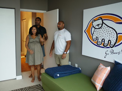
With the help of my loving husband, we were able to pull everything together in 2-3 hours. The parents waited somewhat patiently in the living room as they heard tons of banging and crashing noises. :) It was so worth the wait they said after we revealed the final look of their baby room to them. Just see the facial expressions on their faces! Moments like these are one of reasons I do what I do.

As a gift to the mom-to-be, I got her a super chic diaper bag that doesn't even look like a diaper bag! I wanted to keep it for myself. And of course, it matches the color palette of the baby room.


{Moodboard & Baby Room designed by Chon}

Well I think the baby room worked out wonderfully. Both parties were quite happy, and they both got what they wanted, and then some. Dad got some Chicago Bears elements in there from the colors to the custom canvas art that I was able to compose and stylize with the Bears logo. Mom got her hip baby room that can grow with the baby 'til he is at least 6 years of age. Furniture and colors are pretty neutral, yet fun and sophisticated. Lots of space is still left in the room with tons of storage. Now all they need is a baby boy to warm up the space even more. Congrats to Shirley & Sameer!

There will be more glamour shots of this featured baby room in the coming weeks. Some details are still missing that I still need to add & stylize, and need better daylight to really capture the essence of this room. So stay tuned for more pics! If anyone out there is interested to see my interior decor services + capabilities for Design With Chon, click here.

Also, there is still time to vote and help me out with the CB2 interior design contest. Everyone single vote helps, and it does help bring awareness & support of my business! It takes seconds. Click on Vote for Chon.