[ Visit the New Website to see current design work and to reach Chon for services. ]

Design With Chon (DWC) – a boutique design studio with defined niches in (1) visual communication, (2) event design and (3) interiors. Each of these industries are huge in themselves, but DWC’s goal is to achieve good design in all its various forms, whether it’s from the branding of your business to saying “I do” to transforming interiors. Let me, “Chon," be your personal design consultant + stylist for your business, wedding or home. A balanced environment makes you feel good, and I am here to inspire your surroundings.

Saturday, October 31, 2009

Design w/Chon: Baby Shower I

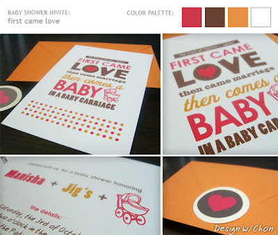
These past months have been jammed with several baby showers. Two of my close girlfriends are pregnant, and they are both due one day apart from each other. So these past weeks have been quite eventful for me since I was one of several hosts to help organize their showers. I had lots of fun designing their baby shower invites since I tried not to do the typical gender, specific baby shower invite with baby powder blues for a boy and light pinks for a girl. Plus, all these showers were co-ed, and I wanted it to appeal to everyone.

In this first shower, I went with a colorful palette that leaned to be more feminine with the hot magenta hue since my friend was having a baby girl. And for her custom invite, I used this fun baby rhyme that we once heard as children – (insert a girl's name) and (insert a boy's name) sitting in a tree, K-I-S-S-I-N-G, First comes love , Then comes marriage, Then comes (insert a girl's name) with a baby carriage. Obviously, I modified the rhyme to be more fitting for the invite.

(Invitation designed by Chon}

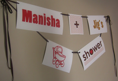
Then for the actual party, I took the color and graphics from the invite to continue the theme for the decor of the shower. Of course, I had to make a custom baby shower sign for the parents-to-be that matched. :)
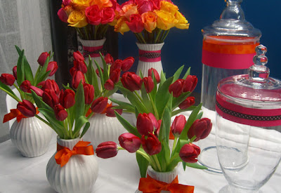
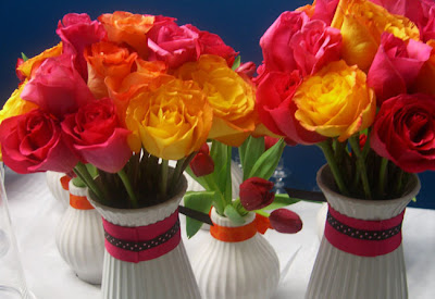
For table centerpieces, we got hot magenta pink tulips, and I arranged them in my white vases leftover from my wedding reception. For a touch of orange, I tied polk-a-dot ribbon bows. Also, we had two larger white vases filled with magenta pink and yellow-orange roses.
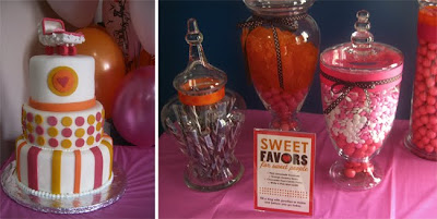
For the shower favors for all the guests, we had a candy bar filled with orange gummies, chocolate swizzle sticks, white & pink mint candies and pink lemonade gumballs that fit perfectly with the decor. I purchased four apothecary jars and hand decorated them all with a variety of polka-a-dot ribbons and made a custom sign saying "sweet favors for sweet people."

And I can't forget the delectable and beautiful 3-tiered shower cake designed and made by my friend's co-worker, Precious. She did an awesome job pulling in the colors from the invite and the custom baby carriage cake topper made it extra sweet!
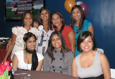
And here are a few snapshots of myself with my prego friend, Manisha, and the rest of the party hosts. Everyone did a great job pulling it all together, and the parents-to-be were loving it all.
Friday, October 23, 2009

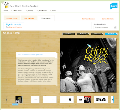
VOTE for my coffee table wedding book!

Does anybody want to help me win a book design contest? If so, it will only take a few seconds, click here and sign in and vote for my coffee table wedding book that I designed on Blurb.com. The great photos, however, I have to give credit to my wedding photographer, Marcin Harla, and our hotel wedding venue, Hotel Baker.

It's a contest of course, and it would be so awesome if I could win. The prize can help me pursue my business further. You do have until Nov. 9th to vote, but just do it today before you forget. If this at all convinces you, I will be out of a job by the end of the year thanks to the economy. But no worries, I will land on my two feet just fine, but do vote. :) Thank you everyone who supports me.

Tuesday, October 20, 2009

Our Wedding Thank You Cards

For our wedding "thank you" cards, I had custom cards printed from Moo.com. I uploaded one of our professional wedding pics from our wedding. Of course before I did that, I retouched the photo so we looked flawless. I had to get rid of the bags developing under my eyes from the week of late nights and early mornings preparing for our wedding. :)

We got so many compliments from the card due to the photography and since I hand wrote over 80 personalized thank you notes. We don't get enough personal letters or handwritten cards these days. By taking that extra step to personalize it, I think it makes it so much more special for people. I know I enjoy it when I receive a personal note.

Monday, October 19, 2009

My Wedding Design & Decor: Part V

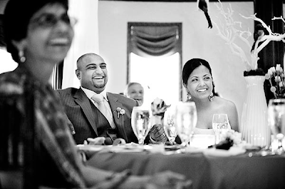
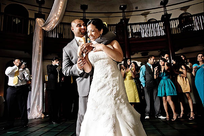
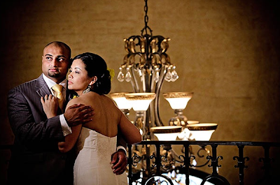
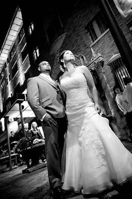
In all the previous blog posts for the design and decor of my wedding, these gorgeous images were beautifully captured by our wedding photographer, Marcin Harla. My husband and I couldn't have been any happier with the way our wedding photography turned out. Marcin did an excellent job, and he was a pleasure to work with.

Before I even went with Marcin Harla, I looked at and researched every photographer possible in the Midwest region. Thanks to the Wedding Photojournalist Association, I was able to find him. My requirements for the photographer was definitely the photojournalistic style, but I also knew I wanted something much more. With Marcin, it was his editorial eye which appealed to me, and his use of natural and artificial light in his work was truly outstanding. And of course, he caught those candid moments between my husband and I that make you smile inside.


(©2009 Marcin Harla Photography}

My Wedding Design & Decor: Part IV

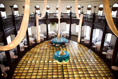
Our wedding and reception was held at Hotel Baker in St. Charles, Illinois. This historic 1920's hotel has original glass tiled floors that light up. It certainly was a beautiful backdrop for all of our pictures.

To bring the attention to the head and cake table, satin blue linens covered these tables. Also, I made custom Mr. and Mrs. name signs to adorn our chairs.

The main centerpieces for the reception tables truly reflect the theme and design of our wedding invites. I custom spray painted Manzanita branches bright yellow and accented each branch with "blue" birds that I was able to find at Michaels. The Manzanita branches came from Save-On-Crafts, a good source for wholesale decor for any event.

In keeping with the rustic and fun theme from my inspiration board, for my wedding favors, I had little nests filled with chocolate covered almonds coated in a blue shell placed at each table setting. These look-a-like eggs are from Oh! Nuts, and they were a big hit amongst my guests – tasted good and fun to eat.

For our lovely three-tiered wedding cake, it was custom made by Rolf's Patisserie. I had it decorated to match the invite design, too. Yellow branches made of icing wrapped around the cake, and clusters of "blue" butterflies nestled all the way up the branches. Although the butterflies were made of a plastic material, however when you bent the wings, they looked very life-like. These awesome butterflies are from Clear Cut Crafts on Etsy.com.

One last detail that I want to highlight is our cake topper. I had the typography of our names from our wedding invite made into the topper. I found a vendor online (I can't recall the name at this point), and they were able to take my design file and laser cut an aluminum sheet of metal. Of course, I spray painted the topper yellow to match the rest of the wedding decor. :)

(Wedding decor is designed by Chon}

My Wedding Design & Decor: Part III

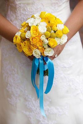
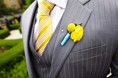
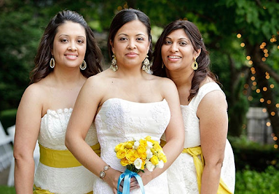
All our wedding flowers are from wholesale online flower vcndors. I used two types of flowers: Spray Roses and Craspedia, also known as "Billy Balls". My bouquet was composed of white and yellow Spray Roses with clusters of Craspedia. To contrast the white and yellow, I added hints of blue ribbon from Michaels to all the bouquets and boutonnieres.

Here is a list of some Wholesale Flower Vendors that I used:
  1. Whole Blossoms
  2. Fifty Flowers
  3. Grower's Box
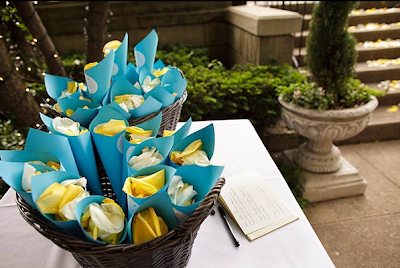
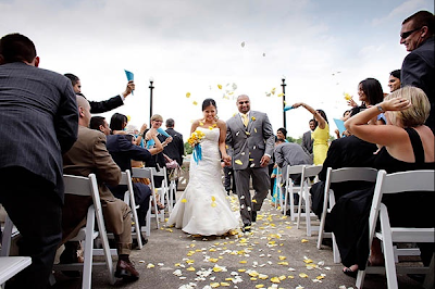
To add color and decorate the wedding ceremony site, I had a mix of yellow and white petals sprinkled all along the walkway. Also, I made custom blue paper petal cups sealed with circular labels that had a personalized message to our wedding guests.

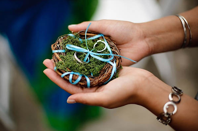
The blue paper and 4.5" diameter nest is from Michaels. Of course, I added the green moss and blue ribbon to personalize the ring nest to fit into my wedding palette. :)

(All florals & wedding accessories designed by Chon}

My Wedding Design & Decor: Part II

To set off the mood of our wedding to our guests, we sent these fun, oversized 7" square invites announcing our wedding date. The two wedding primary colors were used throughout the custom design of the typography of our names and the map. In keeping with our mood board, the nature element was brought in through the "blue" birds and branches in the component invite pieces.

Our invites were professionally printed by a local Chicago printer, AccuColor Plus, Inc, on a conventional offset printing press on Strathmore, uncoated 120lb paper.

(Invitation designed by Chon}

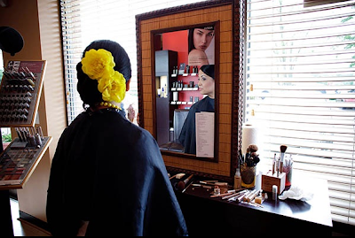
The two bright yellow roses in my hair are from Mikiye Creations on Etsy.com. I custom dyed the florals yellow since they came only in white at the time. However now, Mikiye Creations does custom dyeing to fit your needs. Just contact her personally for specific requests. Her flowers feel and look very real for being artificial.

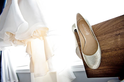
Some of the subtle, classy elements were brought in thru my gold-toned chandelier earrings and bracelet from Banana Republic and my dress shoes are from Boutique 9.

My Wedding Design & Decor: Part I

It has been a long, long time since my last post. My schedule has been overwhelming lately with work, life and baby shower planning that I can't seem to get myself to make any blog posts. I am finally seeing light at the end of the tunnel, and I am seeing more free time in my schedule. Well to get things back on track and my mind back on Design and Decor, I thought I should a recap of my wedding design. I have been meaning to do this for awhile so everyone can learn the source of my finds in planning my day. :)

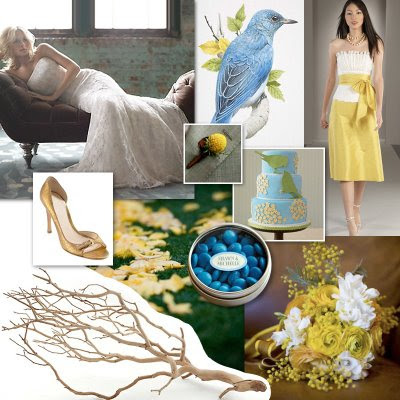
First, let's recap the color and theme of my wedding. Since it was a June wedding, I wanted a sunny, intense yellow and the blue hue of the sky to be the visual focus of everything for my day. Also, I wanted the day to visually summarize into these words: Classic, Rustic and simply Fun.

The traditional white, lace, and the bronze/gold hues represents Classiness. The Rustic appeal comes through with natural, outdoor elements – the twig branch, bird and grey tones. And what makes it Fun is the untraditional use of these intense, summer colors of yellow and cyan together. No pink hues here.