[ Visit the New Website to see current design work and to reach Chon for services. ]

Design With Chon (DWC) – a boutique design studio with defined niches in (1) visual communication, (2) event design and (3) interiors. Each of these industries are huge in themselves, but DWC’s goal is to achieve good design in all its various forms, whether it’s from the branding of your business to saying “I do” to transforming interiors. Let me, “Chon," be your personal design consultant + stylist for your business, wedding or home. A balanced environment makes you feel good, and I am here to inspire your surroundings.

Friday, June 24, 2011

A Whole Lotta White...

It's Friday! And today "White Space" is the topic for "Bridging Design Friday" between Visual Communications, Events + Interiors.

Quite a few individuals see White space as a negative, emptiness, basically a blank canvas that needs to be filled with stuff. A creative person, on the other hand, sees and uses it as a tool to balance and enhance details. White space, when used right, is the perfect backdrop to showcase + accent good design.

[Business]
Subtraction.com Website
Yellow Duck PR Corporate Identity via Design With Chon
Hotel Ambrose Corporate Identity via Miklos Kiss
NY Times Style Magazine Website

White can represent a lot of things, and the qualities that I love most is its sense of purity, freshness, timelessness, and it brings about a chic factor that you can't get with any other hue.

A good trick with white is, embrace it in abundance. Say about 95% of your visual playing field is white, and in the other 5%, use one or two colors strategically in a graphic design layout or in an environment, and it will make a simple, but bold visual statement. For good examples of this, see the Yellow Duck PR brochure above, Red Rose Petals in the Ceremony Aisle below or the Grey + Gold Decor Accessories in the Bedroom shots below.

[Wedding + Private Events]
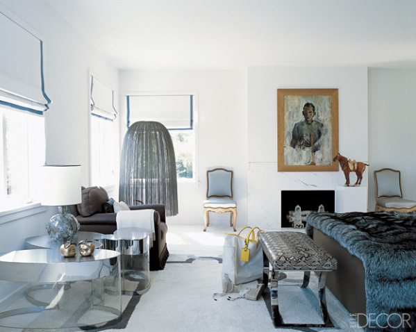
Wedding/Reception images via Storied Locations Blog

[Interiors]
Bedroom via Elle Decor

Remember White Space can be your friend, and it can be friendly on your budget, too. For Wedding/Private Events, most reception venues always have white linens in-stock for table covers/ napkins, and it's available to you as part of your booking. Use it to your advantage, save a buck on the linens, and invest in gorgeous florals for your table that will pop off of the White backdrop of the linens. If you're looking for a dramatic mood shift for the reception, cheat the space with colored environmental lighting. And coincidentally, "White" fabric is the go-to backdrop to bounce the full spectrum of light rays.

Thursday, June 23, 2011

DWC Work: Basement Renovations Cont.

It's "Interiorizing Thursday" + there has been progress on my end in determining the functionality and storage in our basement renovations. Between office supplies, miscellaneous media unit components, personal things and areas to hide potential future kid stuff, I want to maximize the space as much as possible while still maintaining a clean, modern aesthetic and easily liveable for all our demands. All I know is that I have to make some MAJOR decisions by the end of this week so we can submit our permit, get it approved and begin framing + start the build out!

Since my last post, I am pretty sure that I am moving forward with the navy blue sectional sofa below vs. the grey sofa. I think it's going to look great with the charcoal grey wallpaper that I have chosen. So far I have been lucky with some good finds. I bought (1) leather club chair on sale, and it looks exactly like the one pictured below. Grey patterned area rug + silver metal side accent table is done, too.

Now what shall I do for our main Entertainment Media Wall??
I have 3 visual options below for closed + open storage around the large flat panel tv (specifically requested by my husband). Behind each open shelving area, it's going to be painted a navy blue hue for contrast, and it will help showcase my fun accessories + art. Most of the basement will be covered in the charcoal grey wallpaper with navy blue accents and white shelving/storage units.

There is one layout that I really love – Option 2, because it allows for extra "pouf" seating storage below for when we have larger gatherings. Which one would you like to see applied to this space? Comments are always welcomed.

[Entertainment/Media Wall - Option 1]
[Entertainment Wall - Option 2]
[Entertainment Wall - Option 3]

For most of the basement furnishings, I am using a combination of prefabricated units to help offset costs; however, I am investing in one beautiful custom built piece, a wooden L-section desktop seen below. Hopefully, it will be in a solid Walnut finish to warm up the cool environment. At the moment, it does look like the desk unit is floating, because we are viewing it through a wall in my floorplan drawing. I can't wait to order + see these glass dew drop pendants in person and in the actual office space, too.

[Office + Living Entertainment Area]

NEXT STEPS:
  1. Finalize measurements, floor plan  + structural concerns
  2. Visually figure out the storage layout in my Art Studio
  3. And can't forget, time to purchase key items. Shopping time! :)
Also, stay tuned for real pics of the actual renovations. In my next post for the basement, I hope to have some to share to see the hard labor that goes into it.

Monday, June 20, 2011

DWC Work: Macias Imports Identity + Website

It's Monday and gloomy, and it doesn't look like a great week for June weather; however, I have an exciting and colorful logo identity + branding and website project to share today! I presented the Macias Imports website concept to the client last week, and they loved it and were totally on board. I love it when the client sees the vision!

Macias Imports Inc is a family-owned business of Mexican dried spices and goods, and they came to me about a year ago to develop their new identity, business card and other collateral material. And recently, they came back to me to develop the face of their very first website. I was honored and excited to expand the look of their brand to the world wide web. I have only been working on the website for a month now, and it's still in concept phase as I build out and design the rest of the subpages, but at least you can get a glimpse of the progress that I have made thus far.

[Selected Logo + Business Card]

[Logo Concepts]

Like their logo and for the website, I wanted to embrace the warmth, textures and the Mexican culture while still keeping it clean and contemporary in design so the visual brand lasts over time.

On the Homepage, the main image rotates between three images so it's not so static. Between the motion of the images and the visually colorful graphics, it's simple but artfully done. The website is going to be all html, no flash, so it's easy for the user to view the website from a hand held smartphone or iPad.

[Homepage]
 
[Our Story - Subpage]

[Products - Subpage]
[Logo + Website Design ©2011 Design With Chon]

The Product page is definitely the most interactive but easily maneuverable for the user. When you rollover any of the products in the main image, on the righthand side, the product information pops up.

There is still a ton more work to do to finesse all the fine details of this website project, but at least the visual concept is done and approved by the client so I can begin talking to the programmer to get this website live and active! Stay tuned on the progress of this client project.

Wednesday, June 15, 2011

Napkins Aren't Just for Messes!

We all know what we use a napkin for — to clean up any food residue on our faces or to prevent a spill/accident from landing on our nice white clothes. It's a very utilitarian product, but it also serves a bigger purpose in the grand scheme of things for a wedding reception or any type of party event. Literally, it can make your tablescape "pop" in terms of color + making a visual statement for your reception decor.


Pick a color linen napkin that accents your reception table design. See these great examples of napkin colors that compliment their environments. And remember, you can be creative with the napkin fold whether cinching it down in the middle to make a bow (see above picture) or tucking the dinner menu inside it.


If you're on a budget and you do have to pick + choose on where to invest your money wisely for wedding decor, I say opt for the clean, crisp white table cover linen that is budget friendly and splurge a little on a color or even a patterned designed napkin that embraces the mood + style of your wedding.


Monday, June 6, 2011

DWC Work: My Travelscape Postcard Flyer

Here's a real recent + quick project that I developed for my client, My Travelscape, a boutique travel agency that can be your "one-stop-shop" for all your travel needs. It's been over a year since I developed the logo + brand identity for Nisha at My Travelscape, and I was excited to work on the next advertising material for her company. The brand image of My Travelscape is fun and when I first created the travel icons (airplane, cruise liner, hot air balloon + scooter) to help communicate her line of travel services, I knew they would come handy and serve me well in expanding the visual message to her audience.

As soon as Nisha came to me for her business flyer, I knew right away what I wanted to do. Obviously, I had to keep in mind that this was going to be a more economical budget compared to our last projects such as the thermography business card, lenticular luggage tags or the embossed + spot varnished DM letter, however, the concept and design of this project doesn't have to be compromised due to a lower budget.

Instead of offset or any other specialized print services, we went with Digital printing on standard cardstock paper that was already available in the printer's shop and chose a standard 5"x7" size design which doesn't require any type of custom dies or binding. All of these choices for production are pretty straight forward, but it's the design that makes the printed product stand out. Have a look!


This is a 4-color CMYK job, but we made it look 2-PMS color postcard. The main brand color of My Travelscape is a PMS 321U (a deep green turquoise hue), and played with that color value and a 50% shade of it for the cover design of the postcard flyer.

For the cover design, I was inspired by the look of a vintage world map with the latitude and longitude lines and thought this was the perfect application to superimpose the travel icons to convey My Travelscape's booking services. For the reverse side, I embraced the border design as seen in old school air mail and merged it with a personalized postcard message as though it was thoughtfully written from Nisha at My Travelscape to her addressee.


To further communicate Nisha's knowledge of top travel destinations, I created custom travel stamps to highlight prime vacation spots that she has experienced in her own travels. It creates a visually tactile space, and it's sure to catch the eye of the reader.

[Postcard Design ©2011 Design With Chon]

This may be your standard sized 5x7 postcard with pretty basic printing, but it has a visual punch with bold color, unique tailored design + typographic details. If you're wanting to elevate your businesses visual communications from either an ad placement to a brochure, there is a reason to come to Design With Chon for design services. I bring a fresh eye to what you can do to make your business visually stand out from fellow competitors.