[ Visit the New Website to see current design work and to reach Chon for services. ]

Design With Chon (DWC) – a boutique design studio with defined niches in (1) visual communication, (2) event design and (3) interiors. Each of these industries are huge in themselves, but DWC’s goal is to achieve good design in all its various forms, whether it’s from the branding of your business to saying “I do” to transforming interiors. Let me, “Chon," be your personal design consultant + stylist for your business, wedding or home. A balanced environment makes you feel good, and I am here to inspire your surroundings.

Friday, July 8, 2011

CSW Magazine "Designer's Challenge": Behind The Scenes

Thank goodness for Fridays, and it's a beautiful day to be out! Normally on Friday, I share my topic for bridging the design gap between business, events + interiors, but today I am going to show you a behind the scenes look into the Chicago Style Wedding Magazine "Designer's Challenge" photo shoot that happened back in March of this year. I had to keep all the images + videos hush hush until CSW Magazine launched and published it, and that's what happened this past Wednesday.

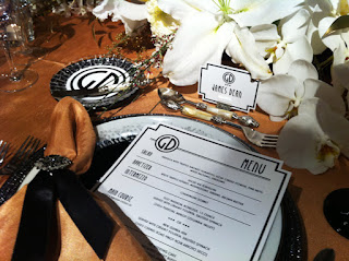
Technically, you could say this post covers business, events + interiors, because aspects of my logo + branding background was integrated into the thought process of the invitation and the matching event collateral pieces. As you can see, the iconic monogram was splashed all over the "Art Deco Meets Old Hollywood" themed wedding event that was concepted by the fabulous Master Bridal Consultant, Frank Andonoplas of Frank Event Design that I had a pleasure to work with on this "Designer's Challenge". And we can't forget that the tablescape and all it's surrounding elements are harmonious with the interior environment creating a mood that is captivating, rich, warm, and definitely a dinner reception that any guest would be delighted to attend.


First, I want to highlight the creative process that went into developing the invitation set + event collateral for the "Art Deco Meets Old Hollywood" theme. Before the design came into fruition, I had several conversations with Frank, the planner/stylist, for the look of the invitation. Key words thrown out were Art Deco, Hollywood Glam, Architectural, Black, White + Gold, and of course, it had to be bold, graphic and make a visual statement like the genre that we were going after.

I began with developing an iconic, logo-like monogram that I knew I could repeat graphically + brand across all the extension wedding pieces (menu, place cards, drink coaster, cake). For the invite, I placed the monogram at the top so it would be the visual focal point, and then everything else around it would branch out and balance the visual playing field. I used 2 different fonts, but similar in character so they didn't clash. With the linear lines, I wanted to create structure, shape + movement so it forced your eye to move around the space, similar to what architecture does. In addition, I hand cut the corners to match the movement of the lines and added some glitz with hand applied black crystals.

[Invitation/Event Collateral ©2011 Design With Chon, LLC]

This is definitely not the cookie-cutter layout. Each printed piece was custom designed and tailored to have it's own feel, but still visually cohesive. Click here to see the full collection of images for the "Art Deco Meets Old Hollywood" invitation set.

Now it's time to see the actual photo shoot that the whole invite set was designed for, and here's the whole team that made it happen! Visionary credit for the whole thing of course goes out to Frank Andonoplas, Master Bridal Consultant, who is well known in the Chicago area and recognized for his social planning expertise in the world of wedding + events. Please excuse the photo quality; they were taken with my iPhone, and they don't do the end product justice in terms of color + richness.

THE TEAM
Planner/Stylist: Frank J. Andonoplas, MBC | FrankEventDesign.com
Floral: Anna Held Flower Shop | annaheldflorist.com
Cake: Bittersweet | bittersweetpastry.com
Monogram, Invitations + Event Collateral: Design With Chon | designwithchon.com
Linens: BB&J Linen | bbjlinen.com
Rentals: Tablescapes | Tablescapes.com
Lighting: Yanni Design Studio | yannidesignstudio.com
Chairs: Classic Party Rentals | ClassicPartyRentals.com


I must say, Frank did a superb execution embracing the whole Art Deco meeting the Old Hollywood Glam. You totally feel it when you see and step into the environmental space with all its details. I love the eclectic look and how he carefully mixed metal tones (silver, gold + black) and glassware (clear, black + white) together to create a totally original design. Just in my few hours with Frank on set, I learned a few things about event design, and I hope to learn many more from him in the future. Great job everyone + I hope to cross paths with all these great vendors again!


Click here to see more behind the scenes images to the CSW Magazine photo shoot.

Thursday, July 7, 2011

DWC Work: Basement Renovations Cont.

It's a GO! Permit has been approved + things are about to get dirty. The husband and I cleaned out the basement, some items went to the Salvation Army, and now I need to get rid of the darn weight bench that you see in our future "Office Area". I thought it would be fun to document the whole process of the basement remodeling. So here are initial pics of the basement as it exists currently. Bare, raw + ugly. Looking forward to what it will be in a month!

[Art Studio Room - Currently]

Since my April blog post, I decided to change up a few details for my Art Studio. I wanted to really push the envelope in contrasting patterns. Plus, as I was hunting for my grasscloth wallpaper that is covering most of the walls in the living/office area, I found this fabulous Johnathan Adler-like print. You can see it below in the geometric, chain link design in grey. Before I called the Art Studio Room "Barnyard Funk", but it is now "Industrial Chic". I swapped out the whitewashed wood finished with a soft yellow beech wood tone, kept the industrial pendant lamp, brought in more industrial exposed metal in the shelving/desk legs, and pulled out the bold accent color into a few more furnishings and a splash of it on one wall, too.

[Art Studio Room - Moodboard]

[Art Studio Room - Diagrams]
And here's the rest of the basement unfinished...

[Living/Entertainment Area]

[Office Area]

Again. A reminder. Weight bench above is for sale — best offer! You have to pick it up, of course. In the NW burbs of Chicago. Email me at designwithchon[at]gmail.com if you're interested + share it with anyone you might know who wants to buff up for the beaches this summer. I will be putting it on Craigslist shortly.

[Storage/Utility Room]
Once the 2x4s are up and drywall is in place, you won't be seeing the storage/utility space directly like you see it in the above pic. It will all be hidden and tons of extra space for storage. 

Wednesday, July 6, 2011

Rings to Fancy Over

I was suppose to share this post over 3 weeks ago, but never got around to arranging all my fave ring cuts + styles. But now it's done and ready for viewing. I compiled a collection of traditional to the alternative girl for engagement ring styles. These are the ones that catch my in terms of good design and what seems to be the trend for the year.

The classic, single solitaire white diamond ring is and will always be in style so men you can't go wrong there. But if you're future fiance seeks something unique and with a little color, there are ways around it by going with a different cut from the standard round, opting for a colored stone and/or intermixing metal tones.


For stone cuts, I love the vintage influence, but incorporated in a modern way. Some of my favorite cuts are the Asscher, Cushion, Oval and Emerald shapes. And depending on your taste, each of these cuts would be beautiful with a clean, thin band. Or if you're looking to add some character to the ring, embellish the main center stone with pave or small diamonds surrounding the main stone. Braided and woven-like bands are pretty hot right now, too. There are tons of samples of this technique featured in all these pics whether it's a bezel setting or a pronged look.

[White Diamonds – Round + Oval Cuts]

Quite a few individuals don't like to mix two different metal tones together, and I was one of them at one point, until I found some really good examples of where its done well. Like the ring above oval cut white diamond above encased by a thin gold band and smaller diamonds. It's a nice little touch.

[Champagne + White – Asscher Cut]

[Precious Stones – Oval, Emerald + Pear Cuts]

I prefer some color + contrast in a ring even if you can't get a colored diamond. There are some amazing colored precious stones out there that allow you to afford a larger setting. Kate Middleton, the Duchess of Cambridge, received a beautiful sapphire ring for her engagement. Have a look at the Art Deco inspired ring above in the upper left hand corner, I am just in love with the symmetry and the design between the blue and white stones.

How about a deep Emerald green or a Pink tourmaline? Or going for the dirty diamond like the Champagne + Brown hues featured below. Do you think you can pull off a bold, Black diamond? I know I would rock it. :)

[Champagne/Brown Diamonds – Oval, Round + Emerald Cuts]

[Black Diamonds – Round Cut]

There are so many styles, shapes and colors out there to choose from, and it can get overwhelming, but start with something you or she will love such as a specific color or shape, determine your budget, and customize the setting to reflect her personality. And don't forget men, you can get a nice ring, too. How about a matching band that has the same colored stone incorporated into the design, like the black bands above that match the black diamond engagement ring. Aren't they the perfect pair or what?

[Pearl – Natural Oval + Round Shape]