These past months have been jammed with several baby showers. Two of my close girlfriends are pregnant, and they are both due one day apart from each other. So these past weeks have been quite eventful for me since I was one of several hosts to help organize their showers. I had lots of fun designing their baby shower invites since I tried not to do the typical gender, specific baby shower invite with baby powder blues for a boy and light pinks for a girl. Plus, all these showers were co-ed, and I wanted it to appeal to everyone.
In this first shower, I went with a colorful palette
that leaned to be more feminine with the hot magenta hue since my friend was having a baby girl. And for her custom invite, I used this fun baby rhyme that we once heard as children –
(insert a girl's name) and
(insert a boy's name) sitting in a tree, K-I-S-S-I-N-G, First comes love , Then comes marriage, Then comes
(insert a girl's name) with a baby carriage. Obviously, I modified the rhyme to be more fitting for the invite.
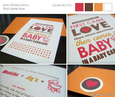 (Invitation designed by Chon}
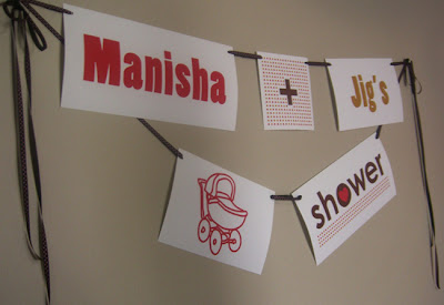
Then for the actual party, I took the color and graphics from the invite to continue the theme for the decor of the shower. Of course, I had to make a custom baby shower sign for the parents-to-be that matched. :)
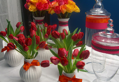
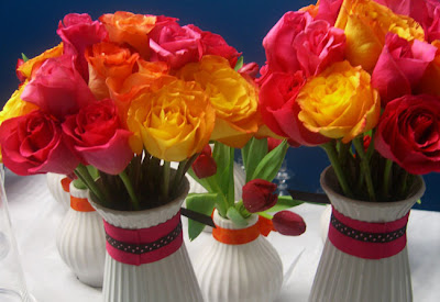
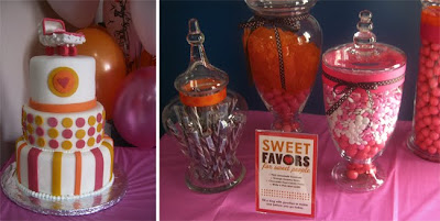
For table centerpieces, we got hot magenta pink tulips, and I arranged them in my white vases leftover from my wedding reception. For a touch of orange, I tied polk-a-dot ribbon bows. Also, we had two larger white vases filled with magenta pink and yellow-orange roses.

For the shower favors for all the guests, we had a candy bar filled with orange gummies, chocolate swizzle sticks, white & pink mint candies and pink lemonade gumballs that fit perfectly with the decor. I purchased four apothecary jars and hand decorated them all with a variety of polka-a-dot ribbons and made a custom sign saying "sweet favors for sweet people."
And I can't forget the delectable and beautiful 3-tiered shower cake designed and made by my friend's co-worker, Precious. She did an awesome job pulling in the colors from the invite and the custom baby carriage cake topper made it extra sweet!
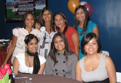
And here are a few snapshots of myself with my prego friend, Manisha, and the rest of the party hosts. Everyone did a great job pulling it all together, and the parents-to-be were loving it all.


 The color palette is sort of complex. I originally had like 3 colors, but I felt I had to expand it to 5 in order to balance the bright, modern colors of the deep plum and the greens with the hues of an old-world map – a buttery, creamy beige and brown.


